How to Make a Difference by May 1st: Customer Experience in Higher Ed Deposit Pages
Creating positive customer experiences is all about reducing negative friction. If, for example, a retailer has a well-designed, intuitive website—this is a positive touchpoint for a customer. If the customer is happy, they’ll be back. If a retailer has a difficult or tedious ordering system—this is a negative touchpoint for a customer. This causes friction; the customer may not want to come back. Amazon knows this. That’s why they’ve eliminated friction points in the shopping experience, notably with their “one-click” payment method, allowing shoppers to make an online purchase and confirm shipping details with a single click. This reduces the amount of friction that exists between a customer’s interest in a product and when they give their money to Amazon. Less friction leads to happier (paying) customers. This is also true in higher ed.
A common source of negative friction for prospective students (one of higher ed’s “customers”) occurs during the deposit process. Perhaps because the deposit happens far enough down the funnel, it doesn’t warrant enough scrutiny by the institution to ensure its effectiveness; or maybe, because money is involved, we believe restrictive protocol and procedure are necessary to protect customers and the institution. I’m not sure. But I do know that, as a designer, I try to be mindful of the human element when I design—in other words, I acknowledge that humans are involved. This requires an element of compassion and empathy in how I design, and an awareness of where frustrations may lie in the user experience. So when I see convoluted, cumbersome deposit experiences in higher ed, it’s a bit of a head-scratcher—your customers want to give you money, so why are you making it hard for them to do so? If you want to increase the number of deposits at your institution this spring, make sure that the process of submitting a deposit is designed in a way that is free of unnecessary, negative friction.
Analysis
To better understand this common source of frustration in the higher ed experience, here’s what I did:
I began with a review of the deposit processes on the websites of eight different higher ed institutions. Starting from the admissions page on each school’s site, I tracked the steps required to locate and access the deposit page (without using a go-url). I also took note of the various types of language used to describe the deposit process. Finally, I evaluated the abundance of unnecessary login portals and the limitations in accepted payment methods.
Finding the Deposit Page
While prospects will likely be given deposit page urls in the direct mail or email communication they receive from an institution, many school webpages fail to provide a clear path from their home or admissions page. This was the case with the schools I reviewed. Considering my penchant for visuals, I thought I’d show you what this looked like.
Below are the eight different journeys I took; each row represents a different institution and each dot represents an individual click. FYI, in the first row, third frame, the click was so far down the page that I couldn’t show it!
So as not to expose the identity of each institution, I’ve redrawn the structure of the pages into a more generic format.
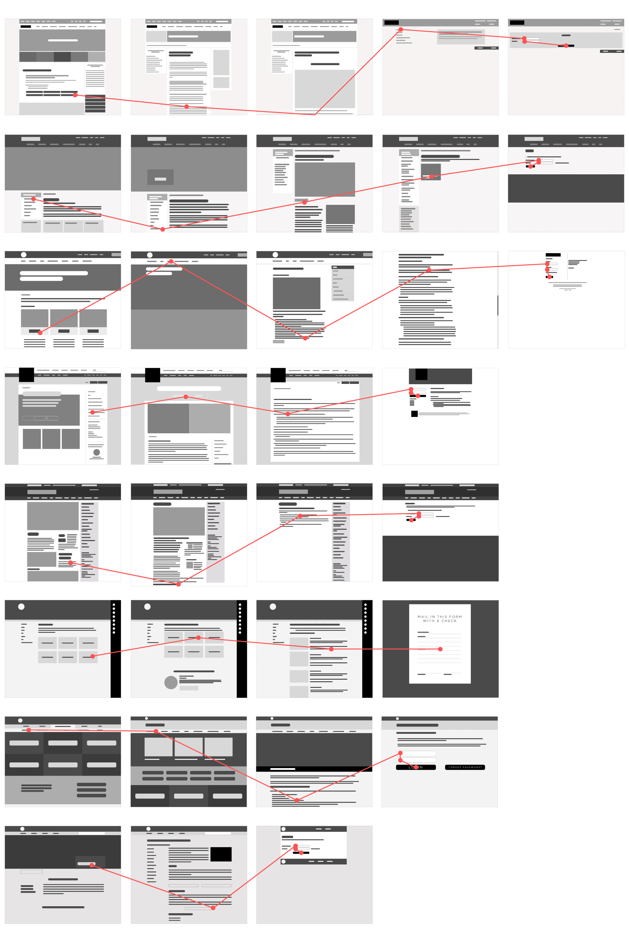
As you can see, in some of these examples, a student has to complete up to 5 clicks just to get to the deposit page. Remember, they haven’t even gone through your login portal—who knows how many clicks they’ll be required to complete in that netherworld beyond the arduous barrier you call a login (more on this later). If this were a transaction in a retail environment, it’s likely you would have already lost the customer at this point.
Language
Another hurdle a student may face in their effort to part ways with their personal resources so they can add to yours is locating where that deposit page lives on your website based on how it is named. In lieu of having an image of Uncle Pennybags and a flashing dollar sign, we tend to dress up the way we ask for a deposit, so as to soften the transactional aspect of the process. And while this is good customer service, we have to be mindful that we’re old hats at this, whereas a prospect is not, so they won’t recognize that there’s a lot of different ways to say the same thing. Going back to the human element of an experience, language is a vital part of the communication process. The language you are using must help a student find where to go to make a deposit (and this might be a conversation to have with your copywriters or communications teams).
Here are some examples of the multitude of ways institutions will say the same thing (sometimes, varying within their own site):

The Login Portal
Whether it’s retail or higher ed, if one’s goal is to make payment as easily and quickly as possible, nothing causes more friction than a login process. On one hand, some verification is necessary. After all, we’re not selling lemonade in the front yard. Ideally, we’ll need to know some information about who is making the payment, and what that payment is going toward. On the other hand, login credentials are a constant source of consternation for many people, particularly when facing issues like:
- “What if I forgot my username and/or password?”
- “What if I need to set up a new one?”
- “What if I never received login credentials?”
- “What if my parent/guardian/family member/friend is paying for me, but they don’t have my login credentials?”
- “What if I don’t know what I’m doing and I need to contact someone for help?”
There’s a whole series of potential issues that could come up, and if they have to be resolved before a student can log in, you’re creating friction around the process—harsh, blistering friction. Again, this is just logging in. Upon verification, there’s a good chance they aren’t even halfway through the process. Based on my research, once a student gets through a login portal, they may face upwards of 15 more clicks before deposit payment is complete.
Payment
If a student hasn’t given up, and if they’ve completed the taxing journey to reach the final payment screen or gateway, they’re more than ready to give you their money. Yet, what we’ve seen far too often, is one final source of friction: type of payments accepted.
You may not be ready to accept payments through Venmo or Square—and that’s okay—but there are a couple of givens in today’s digital marketplace: options to pay with a debit card, any of the four major credit cards (Visa, Mastercard, AmEx or Discover, for those who live life on the edge) and e-checks using personal bank accounts are all a must. If you only accept payment via routing and account number, you’re creating friction. If you only accept payment from Visa and Mastercard, you’re creating friction. If you only accept a personal check mailed into your registrar’s office, you’re basically giving people rug burns. Payment options should be diverse enough to accommodate the broadest range of preferred payment methods.
In some situations, an institution will allow for online payment, but will require a hardcopy form to be printed out, completed by hand and mailed in. That’s more friction. Is this necessary? Perhaps—if it’s what your current infrastructure necessitates. But if your system does not allow for an electronic form submission to accompany the deposit: upgrade.
Solutions?
Fortunately, there are ways to eliminate friction in the deposit process without compromising the prudency required when accepting payment. Several institutions have developed ways to make this process easier for students. Here are a few examples of smarter touchpoint design at work:

To reduce friction, design your deposit page with customer experience in mind. It should be designed in a way that is most convenient for the customer, not an even compromise of convenience between buyer and seller. Be thoughtful about your language, your payment gateway and your login process. How much information do they really need to provide you just so they can submit a deposit? Would first name, last name, email suffice? Yes. Perhaps the last four digits of a social security number, too? Sure. This is all information they’ll likely know off the top of their head. But if you make them hunt for a special username or student ID number, you’re muddying up the process and slowing everything down.
I don’t contend that institutions need to offer a comparable “one-click” service like Amazon to enable students to make payments—submitting a tuition deposit is not the same as buying a Harry Potter book or laundry detergent or a limited release Tears for Fears record from Germany (it’s amazing what you can find on Amazon). But we can certainly be more cognizant of the deposit process, and we can design it to be more effortless for the customer so that it becomes another positive touchpoint along their journey with your institution—not another point of friction.
